Origin
A Full Brand Identity with clear strategy in mind.
Origin partnered with Nubba Studio to reposition a logistics operator around a single idea: that clarity, not just speed, is what makes a supply chain a competitive advantage.


The strategy centred on a simple reframe: clarity precedes confidence, and confidence precedes scale. Rather than positioning Origin as another fast/cheap/global carrier, we defined it as a strategic partner — calm, informed, and precise. We built the brand around a Sage–Ruler archetype pairing (informed guidance backed by quiet authority), which shaped a voice that is clear, consultative, and assured — explaining rather than exaggerating, and replacing urgency with certainty. That same discipline carried into the visual system.
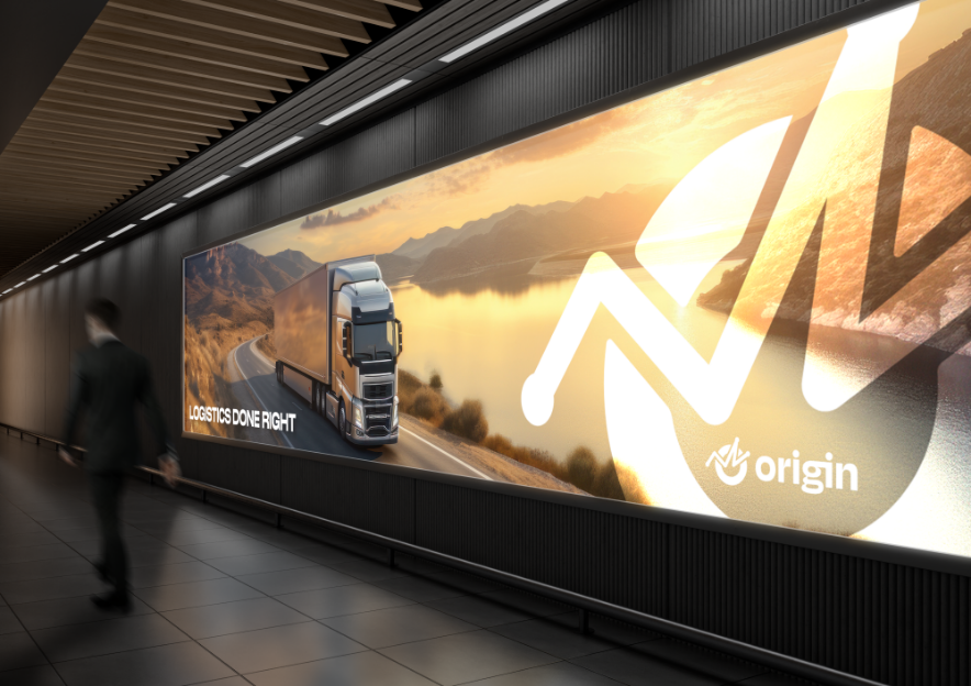
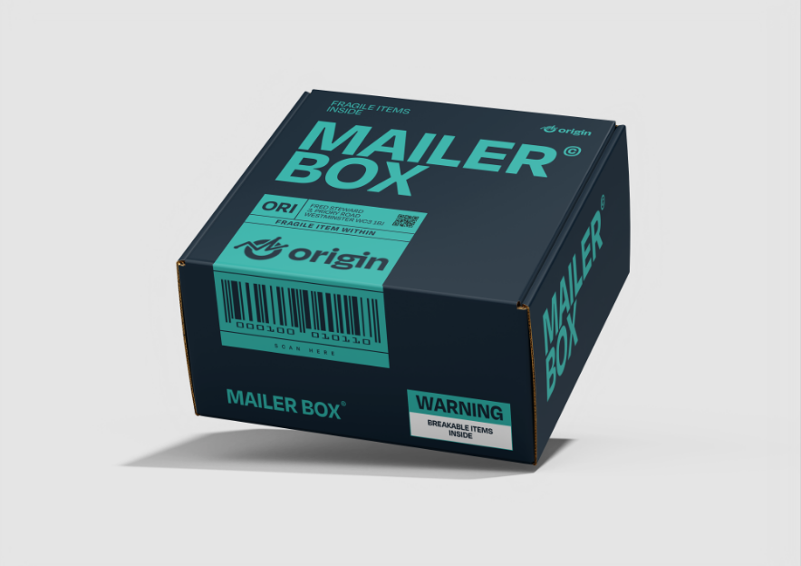
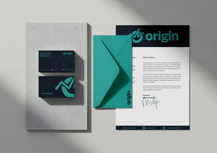
Results - A system built to carry weight — literally and visually.
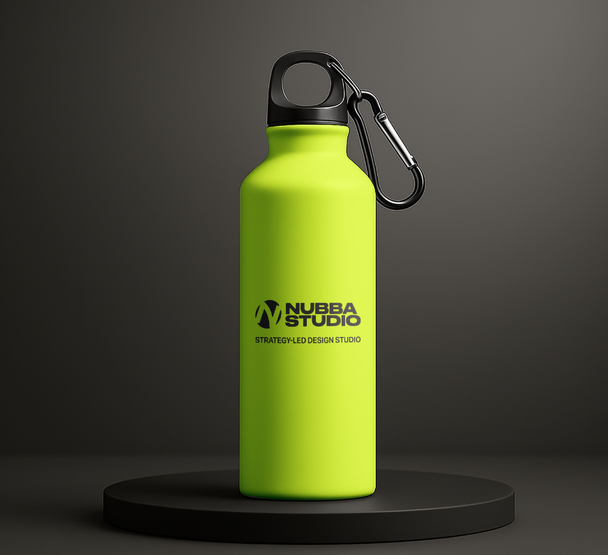
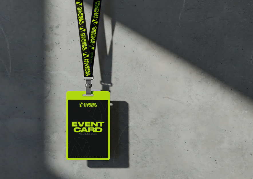
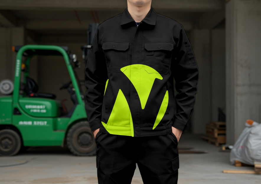
Origin now has a single, cohesive identity that can move between a pitch deck and a shipping container without losing authority. The positioning gives the brand language it didn't have before — a way to talk about planning and judgement instead of only speed and cost — and the visual system gives that language a consistent, confident face across digital, print, and physical touch points. The result is a brand built to be trusted with the decisions that happen before anything moves, not just the delivery after.